Project Overview

The Market

Rock climbing has become increasingly popular. Many gyms are opening, and climbers are looking for ways to connect socially and to be more competitive with their climbing community.

In order to take advantance of this trend, the Climbing Wall Association funded an application which could gather data from member associations, which would allow all gyms in the network to operate more efficiently, and provide better service to climbers.

The application would require a slight increase in member dues. This increased was offset by increased membership at gyms, and by enabling gyms to provide better service. The data and analytics provided by climbers using the mobile app gave an x-ray focus onto climber trends and tendencies.

The project asked for a mobile app which climbers could use while climbing to track their perfomance and social interactions, and a web app which rock climbing gym operators could use to manage the gyms with more metrics.
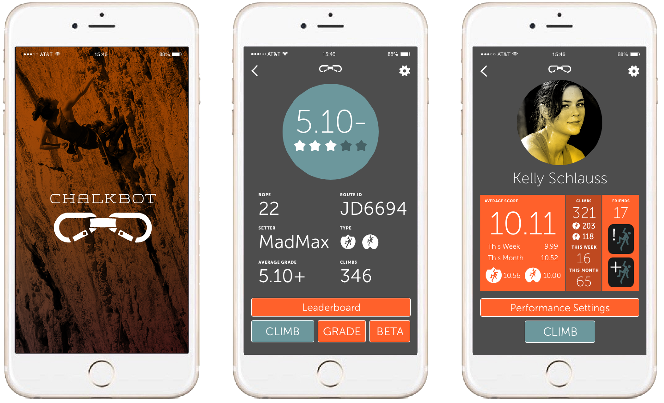
the chalkbot phone screens
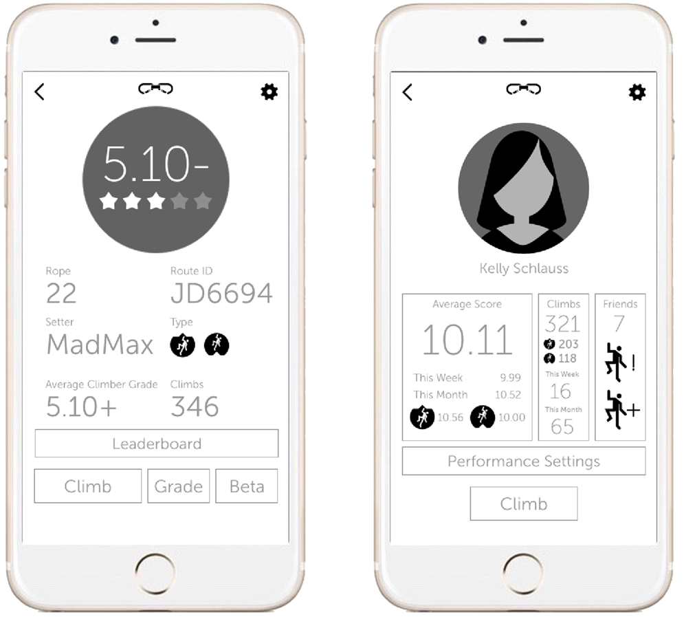
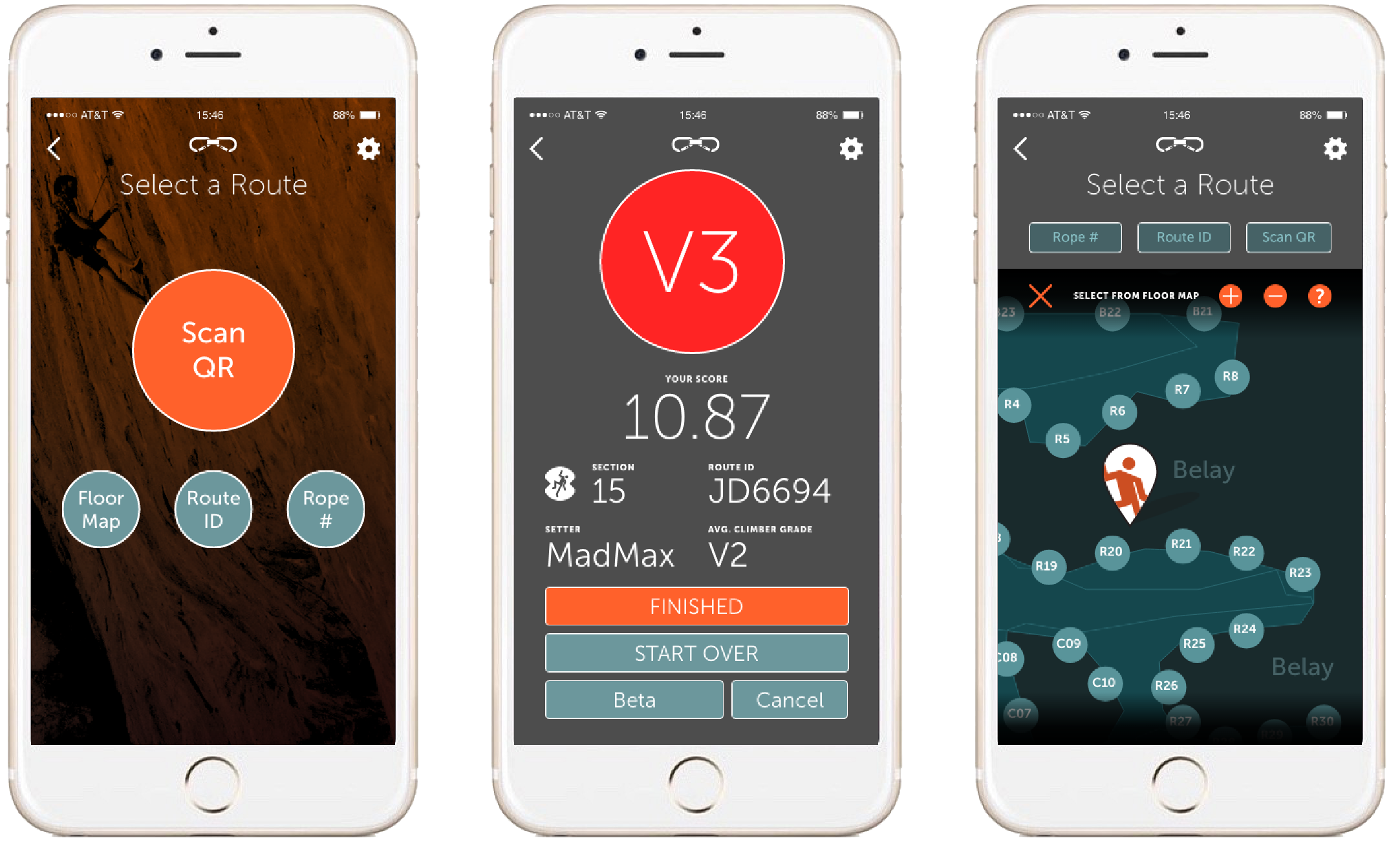
From left: the launch screen, route profile screen and user dashboard. A route profile screen allows a climber to add their own grade of a route, to ask for beta from the setter, and to climb it.
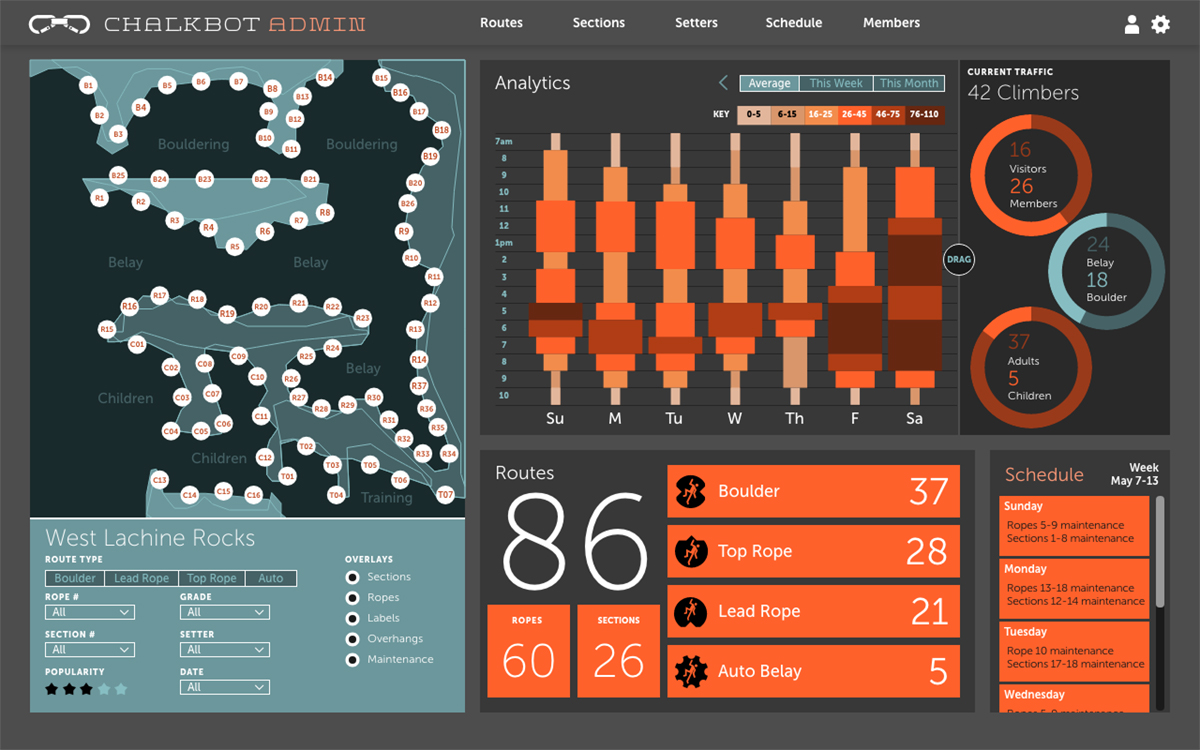
the chalkbot dashboard for admin
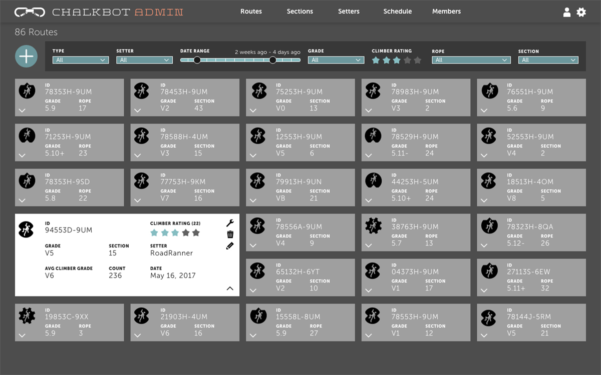
The service provides a web app for gym operators. With this dashboard, an admin can see traffic density at any time during operating hours. They can see a map of all their routes, and use advanced filtering features.

Design Explorations

Research started with paper prototypes and mind maps.

Following a user-centered design strategy, the mobile app was first explored to determine gym climber habits. It explored social interactions and how often climbers had their smartphone with them.

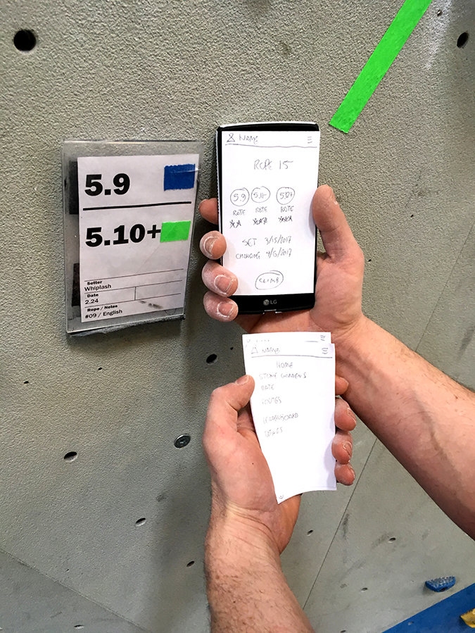
Paper prototype tests looked for distractions with users trying to log a climb without having to spend too much time with their device.

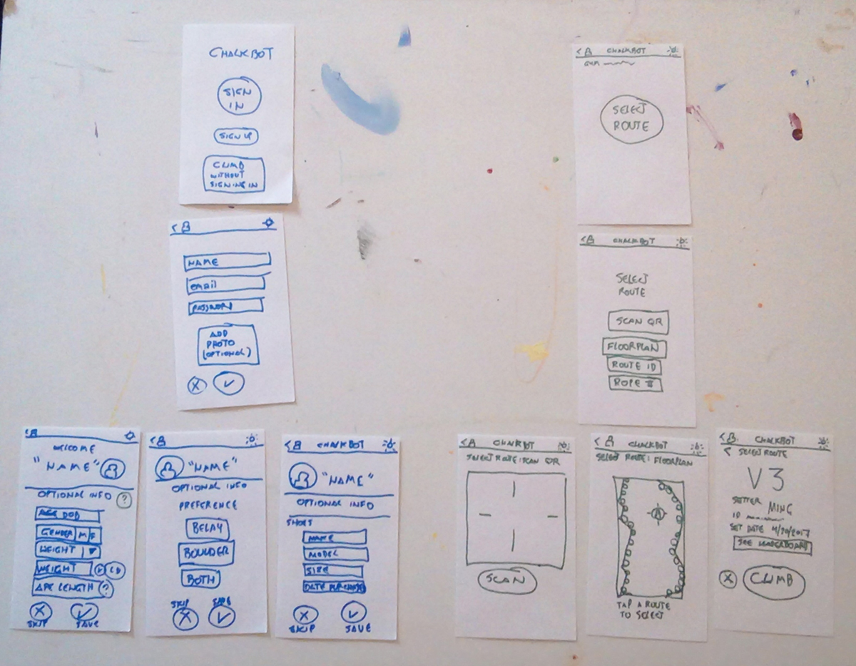
Paper prototypes were created and tested in context at an actual rock-climbing gym.
Several climbers were asked to test the usability with the paper prototypes.
Early conceptual sketches explored optimizing user experience, especially for a climber wanting minimum distractions before beginning.
Paper prototypes led to wireframes for mobile.
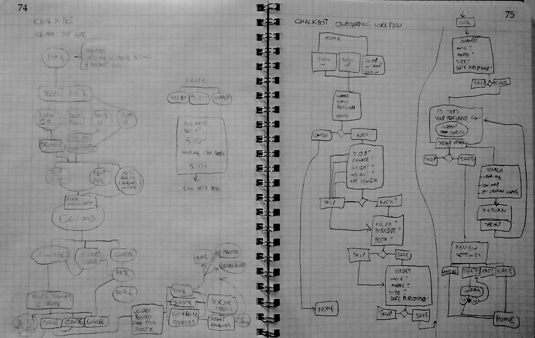
flowcharts were mapped out on graph paper
Flow charts started as mind maps to explore the user story. Initial mind maps were more abstract, connecting features by natural instinct.

Design Explorations

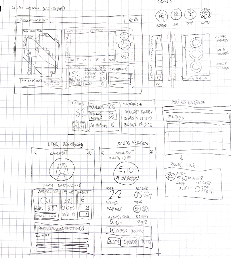
After interviews with both gym climbers and gym staff, and reviews of sketches on graph paper, more refined materials were designed.

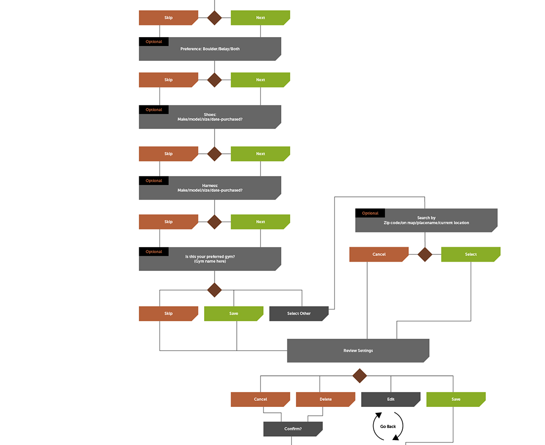
graphpaper wireframes
Detailed flowcharts helped to map out the user's priorities, and streamline onboarding, as in this example.
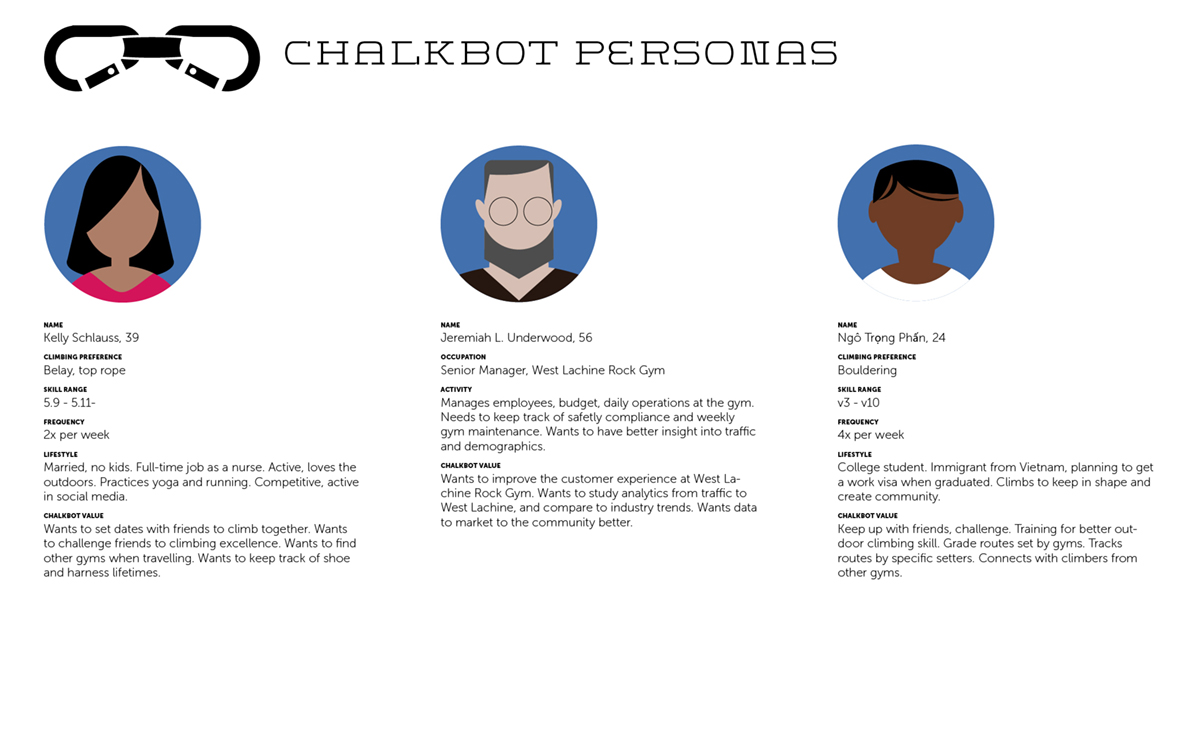
several personas for chalkbot
Personas representing different users, including the rock gym admin, were defined.
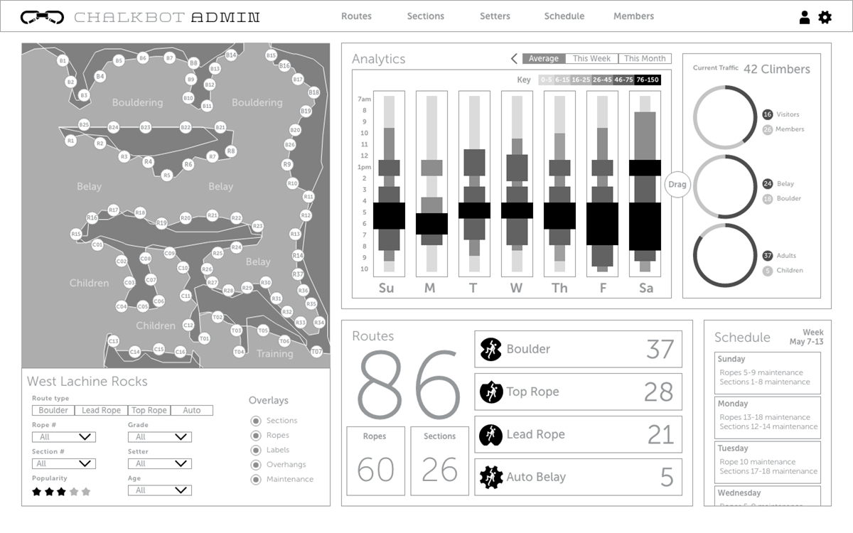
wireframe of admin dashboard
Interviews with staff at an actual rock gym revealed what priorities would be needed on a admin web app.
chalkbot moodboard
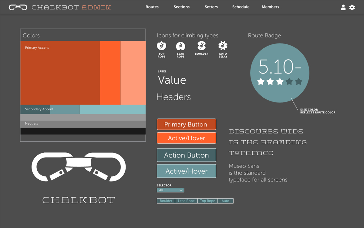
Colors, icons, branding and typography were represented in one screen to determine balance and harmony.

Results

The final design provided a valuable gym management tool for gym operators. It engaged climbers in a social and competitive way which was previously only possible with a combination of social media, texting, email and map apps.

Admins

Gym operators could manage traffic and rope/route maintenance with the analytics provided. The web app also allowed them to print out labels for routes, which would enable climbers to scan a QR code on each route.

Climbers

The app allowed both beginner climbers who made a casual visit, as well as seasoned gym members, to get more insight into their climbing.

The app also allowed climbers to find gyms in other cities when they were traveling.

The Climbing Wall Association saw an increase in gym traffic for their membership by 33%. Gyms which adopted the web app saw an increase in revenue by an average of 14%, and were also able to improve customer experience during peak traffic times.

Out of Scope

Some features were considered which would add better usability to the service. This included support for smart watches, and tracking of altitude.

Some of these features would require an investment of complex sensors in climbing walls. These would be added with a future release.

before and after climb screens
The final design delivered colorful, exciting, and user-first results. These screens show the before and after steps for a user, with simple, thumb-sized buttons for quick selection. The third screen demonstrates how the app uses geolocation with a gym's floorplan to help a climber find a route.
an admin route inventory screen
The admin web app allowed the gym administrator the ability to track their routes, and track climber data from the mobile app.
scanning the qr code
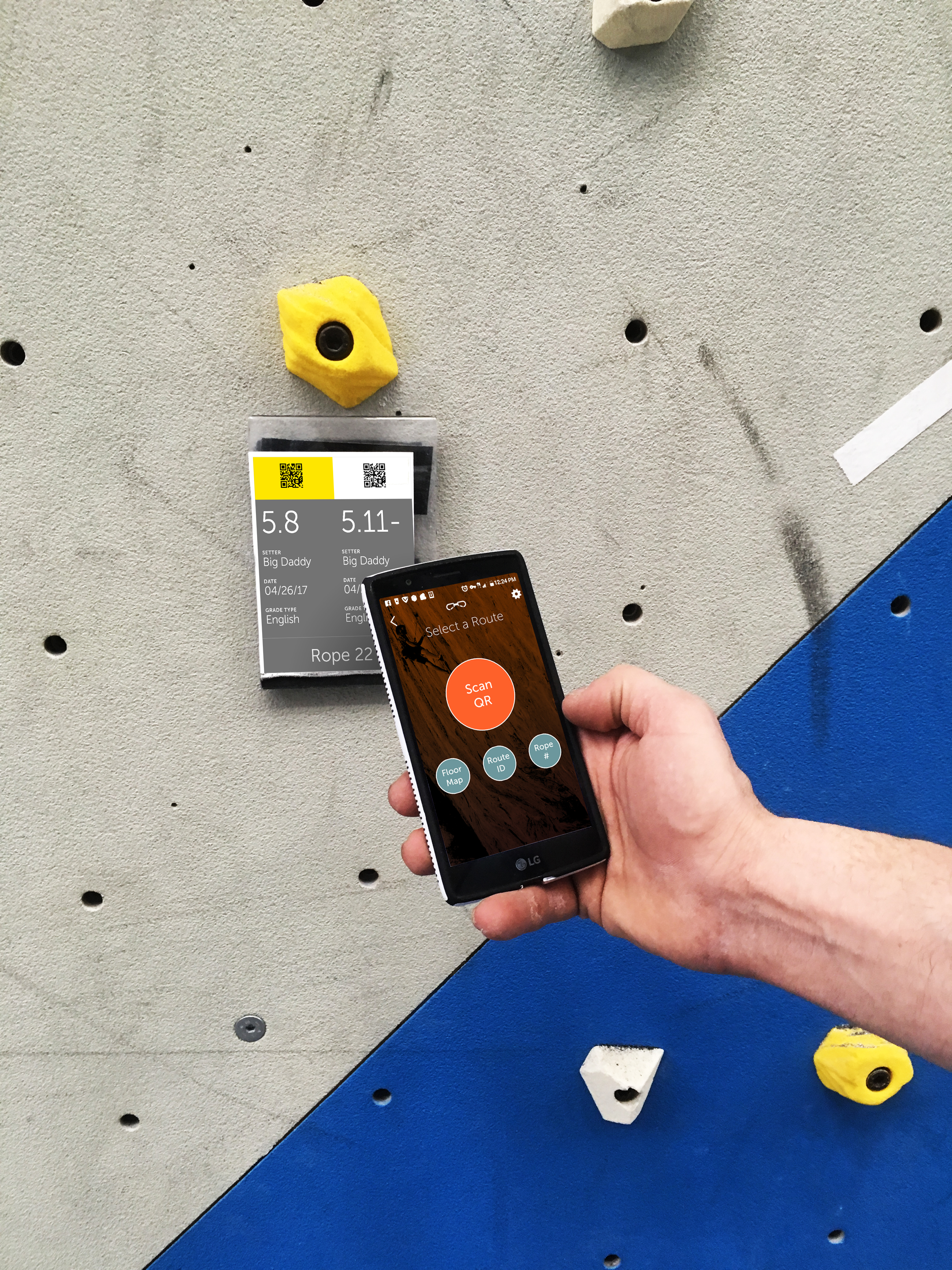
Different methods of entering a route's meta-data were explored, but the most efficient was the QR code. This required the support of the admin service. Additionally, climbers could enter a route identifier, a rope number, or find it on a map of the floor.

/