Project Overview

The Problem

The approximately 30 software products owned and developed by Hitachi Data Systems were being engineered in silos.

The efforts created a lot of assets and practices which were compatible with only one product. The cost was high and delivered reduced efficiency and returns. There was not a central UX documentation portal or repository to align products with visual or experience consistency. Developers often improvised to satisfy short-term deadlines and features.

The User

Personas were identified for UI designers, UX designers, product owners and developers who work on Hitachi software products.

The primary user was the software developer.

Because the UX teams worked directly with the developer teams, domain knowledge was part of the day-to-day routine.

Other users the design system supported were marketing and product owners, in addition to primary stakeholders for any product.
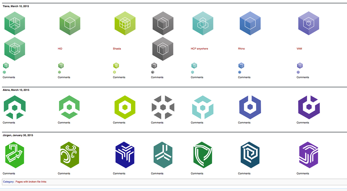
icon explorations
Multiple designers prototyped a product icon system. This was one of the first projects in the design pattern system.
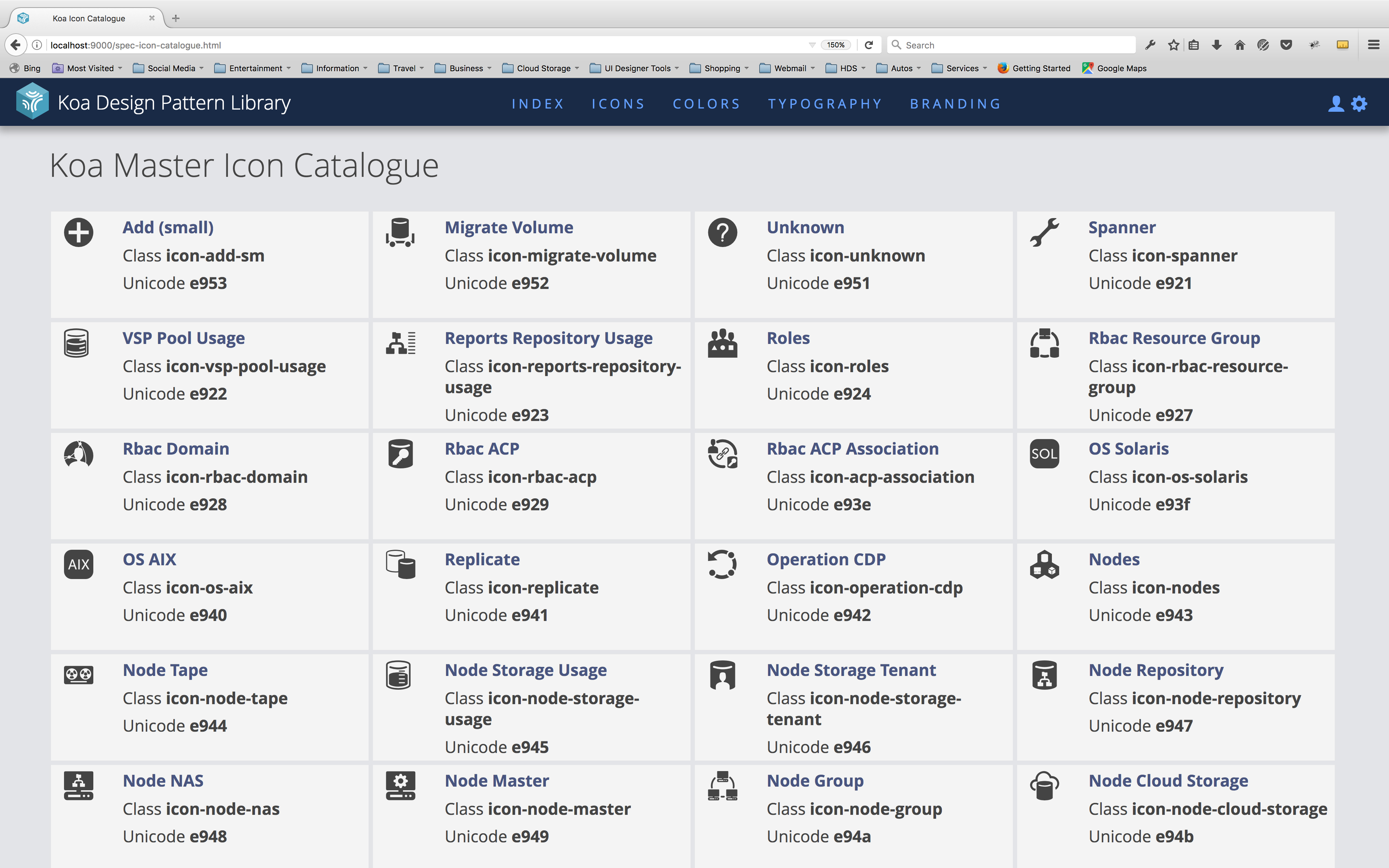
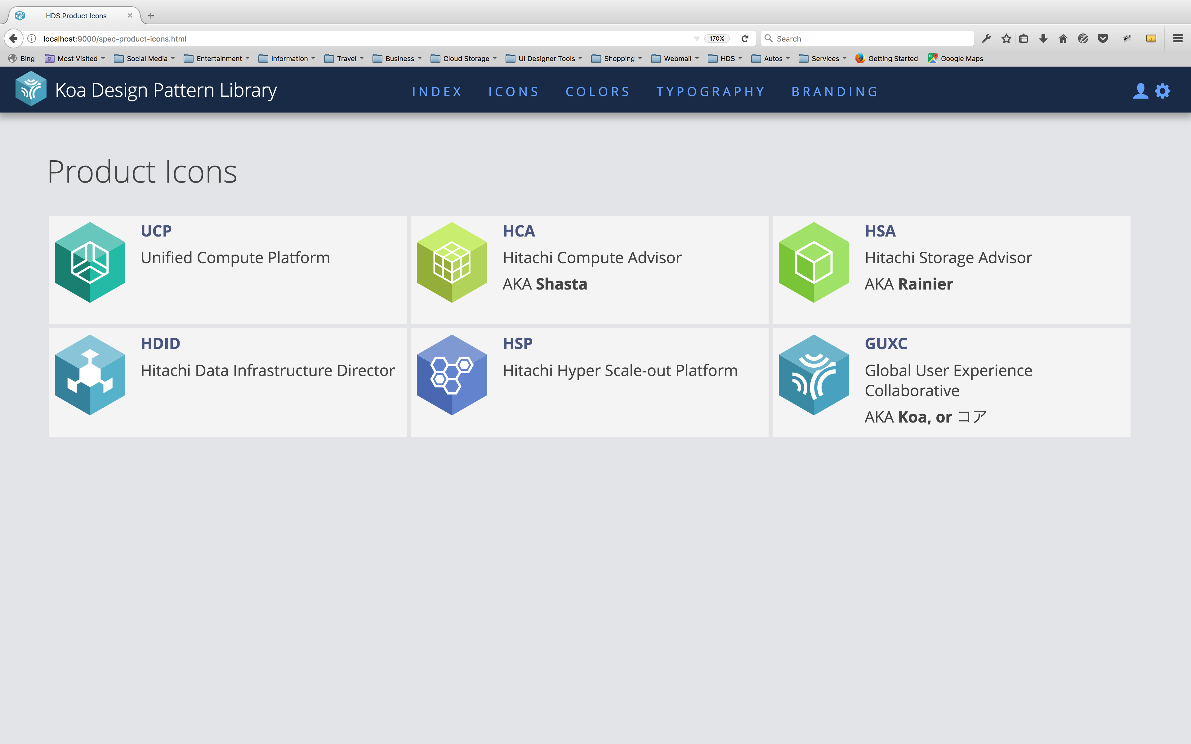
Koa product icon display
Once a product icon system was established, other product teams began to add their product icons to the reference screen.

Design Explorations

The solution proposed was an open-source repository with UI assets, best practices, and documentation.

Initially the product/service was to be named GUXC (Global User Experience Collaborative), but eventually was given a simple moniker of Koa, which is a Japanese translation of the anglo word "core".

The blueprint and roadmap for the project began with a design conference in Yokohama, Japan.

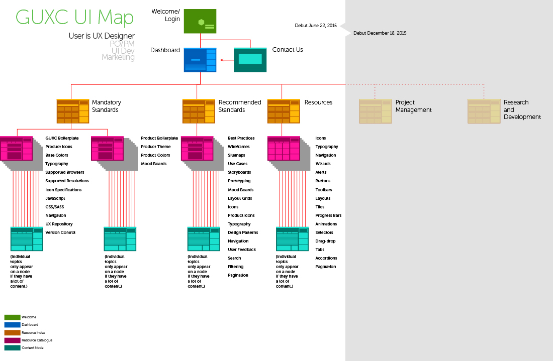
In addition to a list of users, solutions and features were listed and organized into workflows and a sitemap.

the GUXC sitemap
The initial sitemap displayed scenarios for different users, and projected a growth phase.
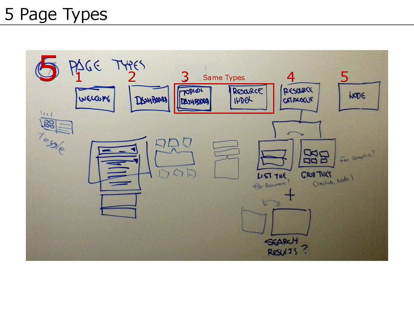
white board of screen templates
In developing the design system as a service, screen master templates were established.

Design Development

The product was intended to support multiple products with one central service. The most efficient way to reach these goals was to create a cost center.

A business plan was written, and included operating a usability testing lab, in addition to a UX Director, two UX/UI Designers, and a developer, to meet the committment.

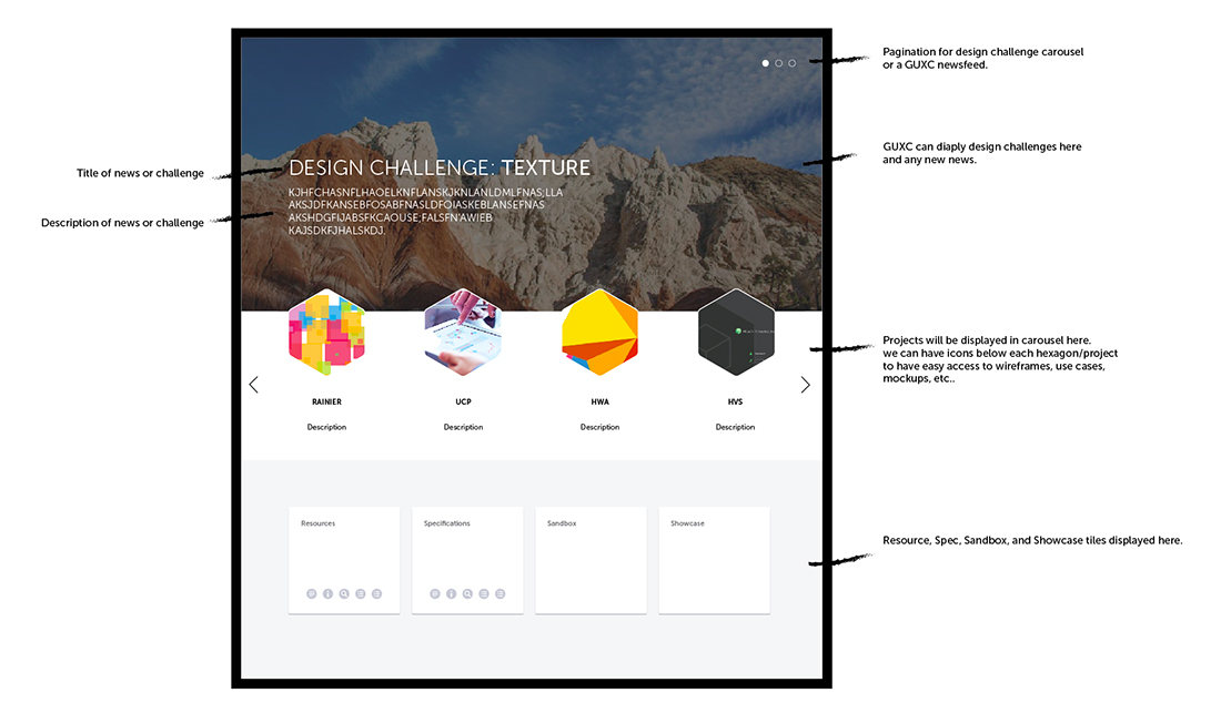
proposed GUXC dashboard designed by Tiana Kavros
This proposed GUXC dashboard was designed by Tiana Kavros, who was a UI/Visual Designer on several product teams.
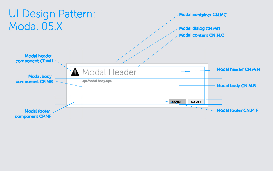
specifications for design components
Documentation for the design pattern library broke components down into their parts, and gave each a part number and semantic name. This enabled developers to more efficiently build out the UI from prototypes.

Design Development (continued)

A broad approach was taken to afford scalability for various products and user bases.

The mission statement emphasized innovation and collaboration, so that one group would not be able to dictate absolute control over styles and best practices.

The strategy called for a boilerplate UI code base which could be cloned and applied to individual products.

Product teams would then complete their cycle and add any new design patterns they required.

At the end of a cycle, the collaborative could review and add new design patterns which were developed.

wireframes for GUXC SaaS
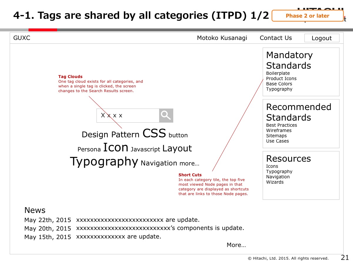
During the conference in Yokohama, wireframes for the various features and functions of the Koa Design System were explored.
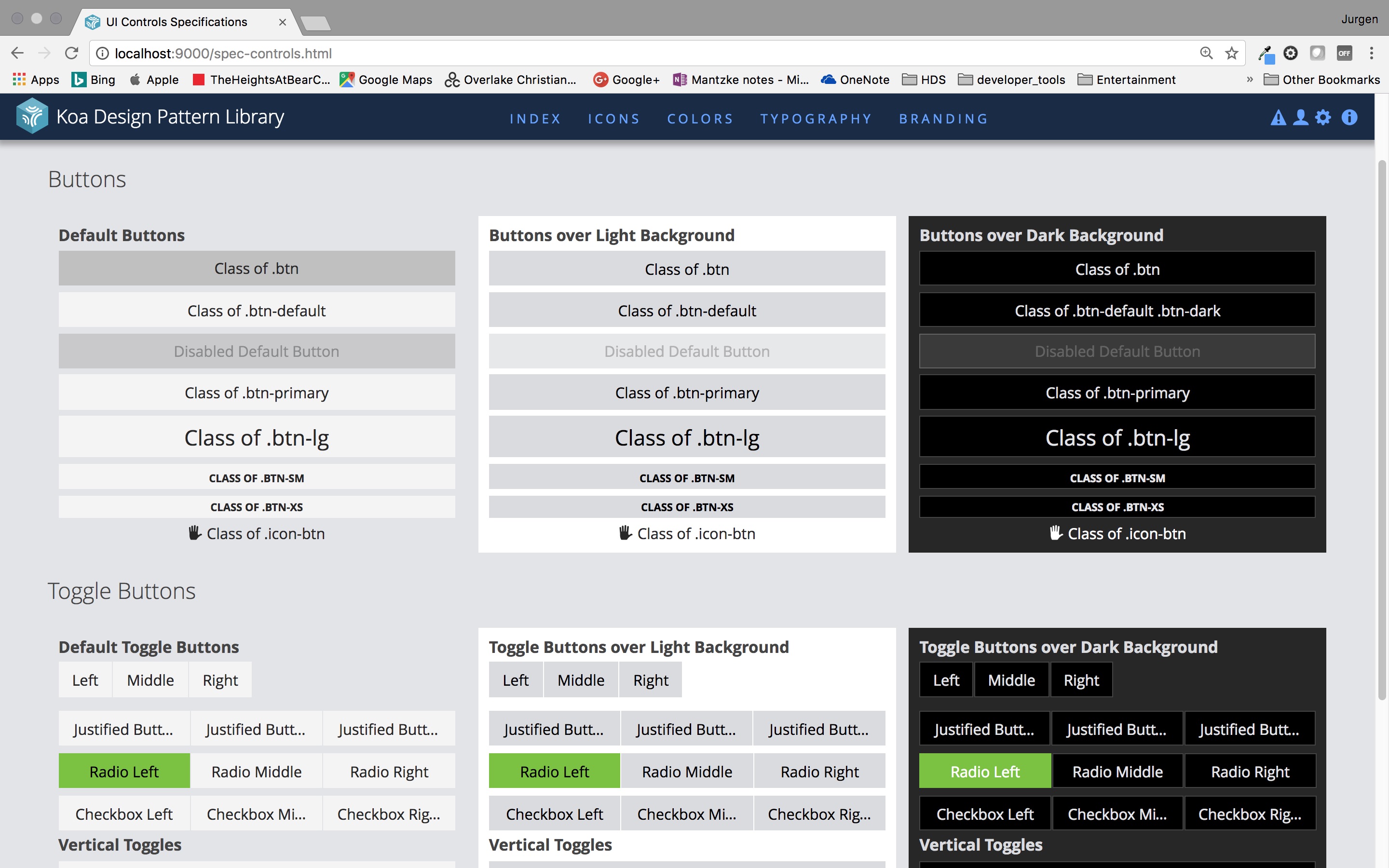
specifications and asset repository of buttons
When a developer accessed the pattern library, they could see examples of the UI assets in context, using native code.

Results

The business plan was reviewed by the financial team, and a budget was proposed.

Research was done to determine how other major corporations with a successful design strategy organized a design system.

This research was applied to a final presentation to the executive level of our organization. It was approved and considered a value to engineering.

The Koa Design Pattern Library was then slowly implemented to other product teams. Initially other products could use only parts of it, until a common framework could be used across the organization on the back-end.

An SVG-based icon font was created, and a system for adding icons to serve all products was established. When a product team needed new icons, they would design rough ideas in Adobe Illustrator, then submit them to a UI designer in the Koa team to refine and scrub for conisistency. Then the icon font would be updated and posted in the repository.
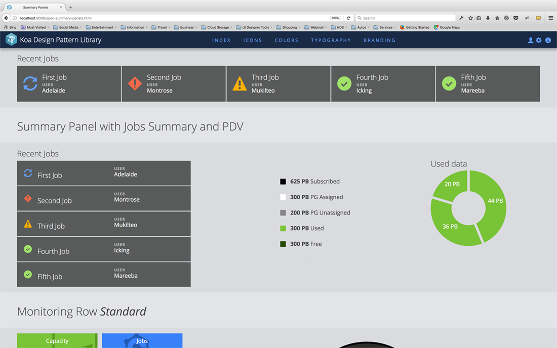
koa prototypes
The Koa design pattern library initially started as a UI repository for Hitachi Storage Advisor, which was showcased by product managers and sales people as an example of a new, fresh direction for design of Hitachi Software. Koa then could be used to prototype in product cycles, when static mockups were approved. The prototypes would be added to specific sections of Koa and shared with stakeholders.

/