Project Overview

The Need

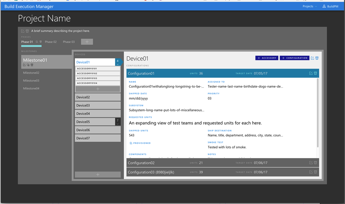
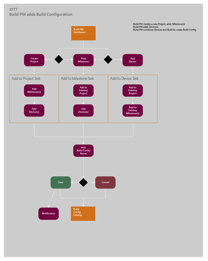
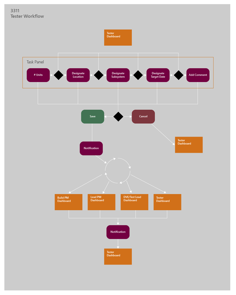
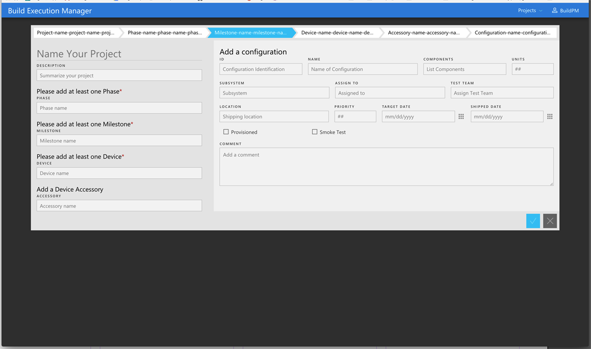
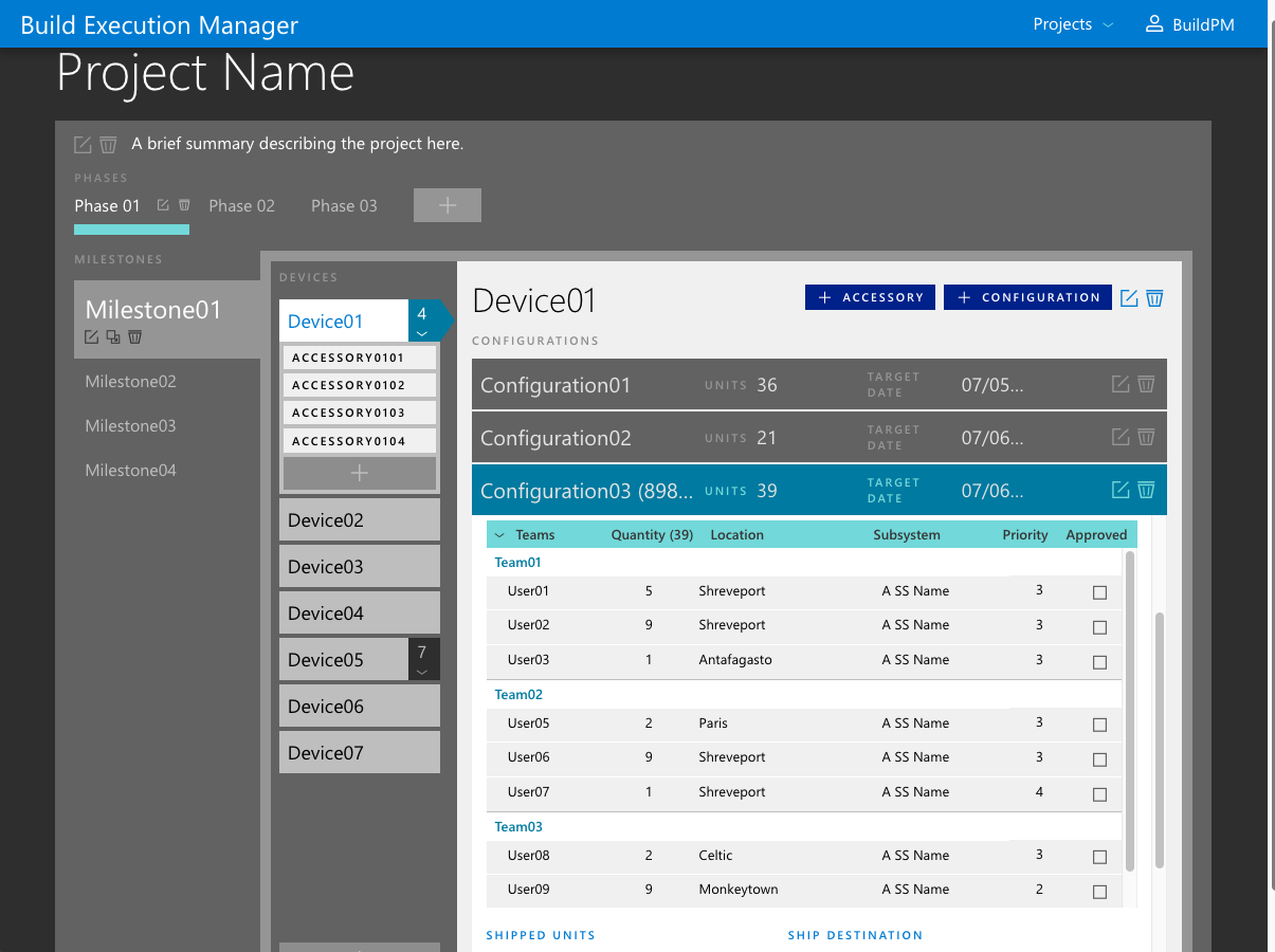
The Microsoft Surface team needed an internal tool to help manage device configurations better. At the time, information was being exchanged with spreadsheets and email. This process led to misinformation, confusion and a slow work pace.

Value Proposition

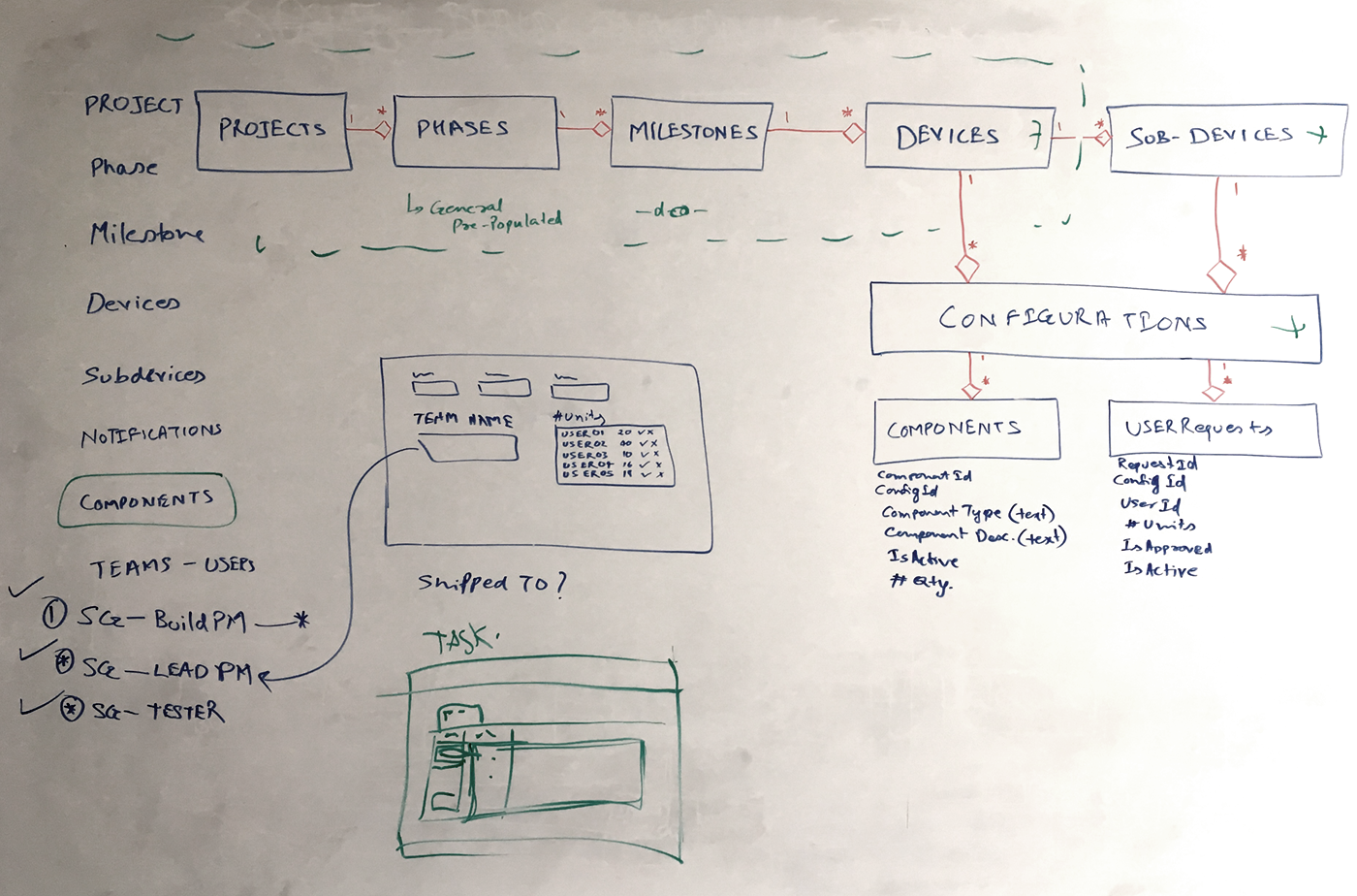
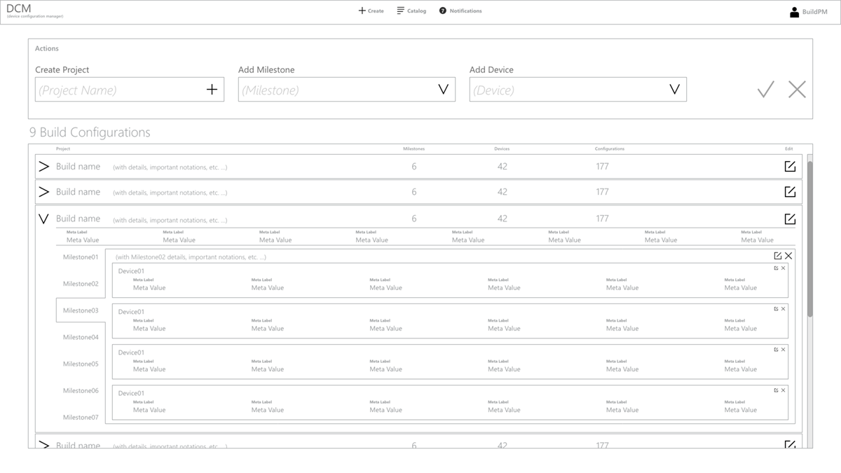
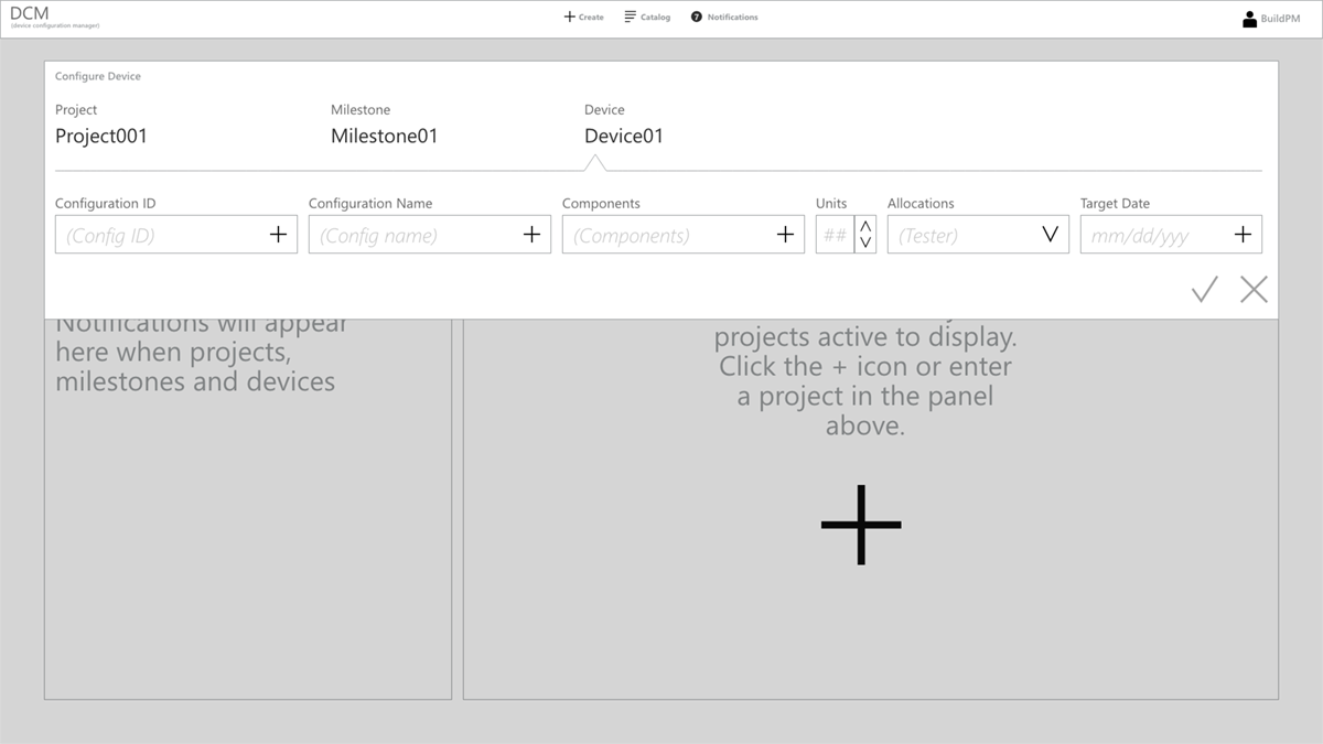
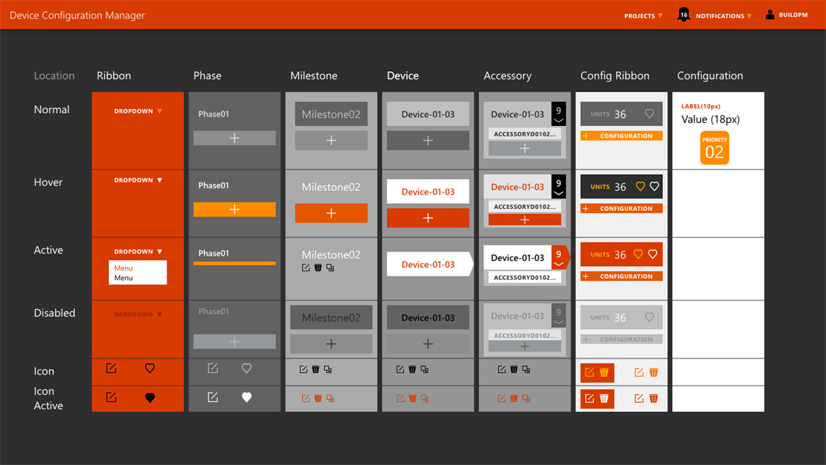
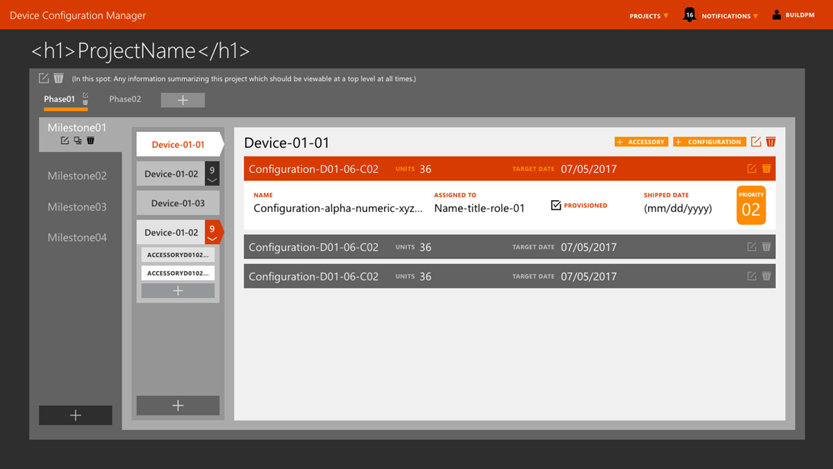
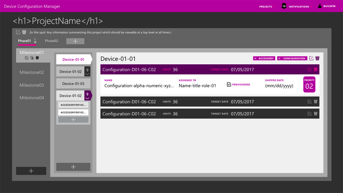
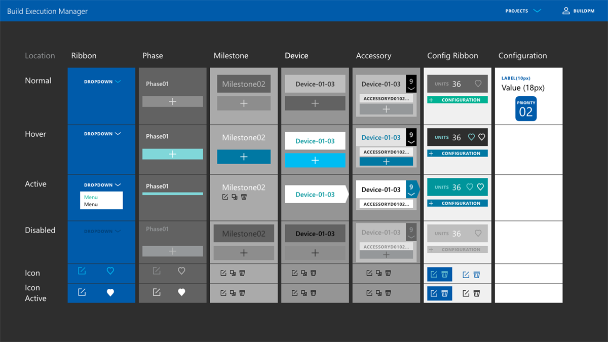
The proposal was to create a web application which would allow all levels of device configuration teams to complete a specific device profile easily and efficiently by having a common area to store and update information. There were four authentication levels, with decremental permission levels.

My Role

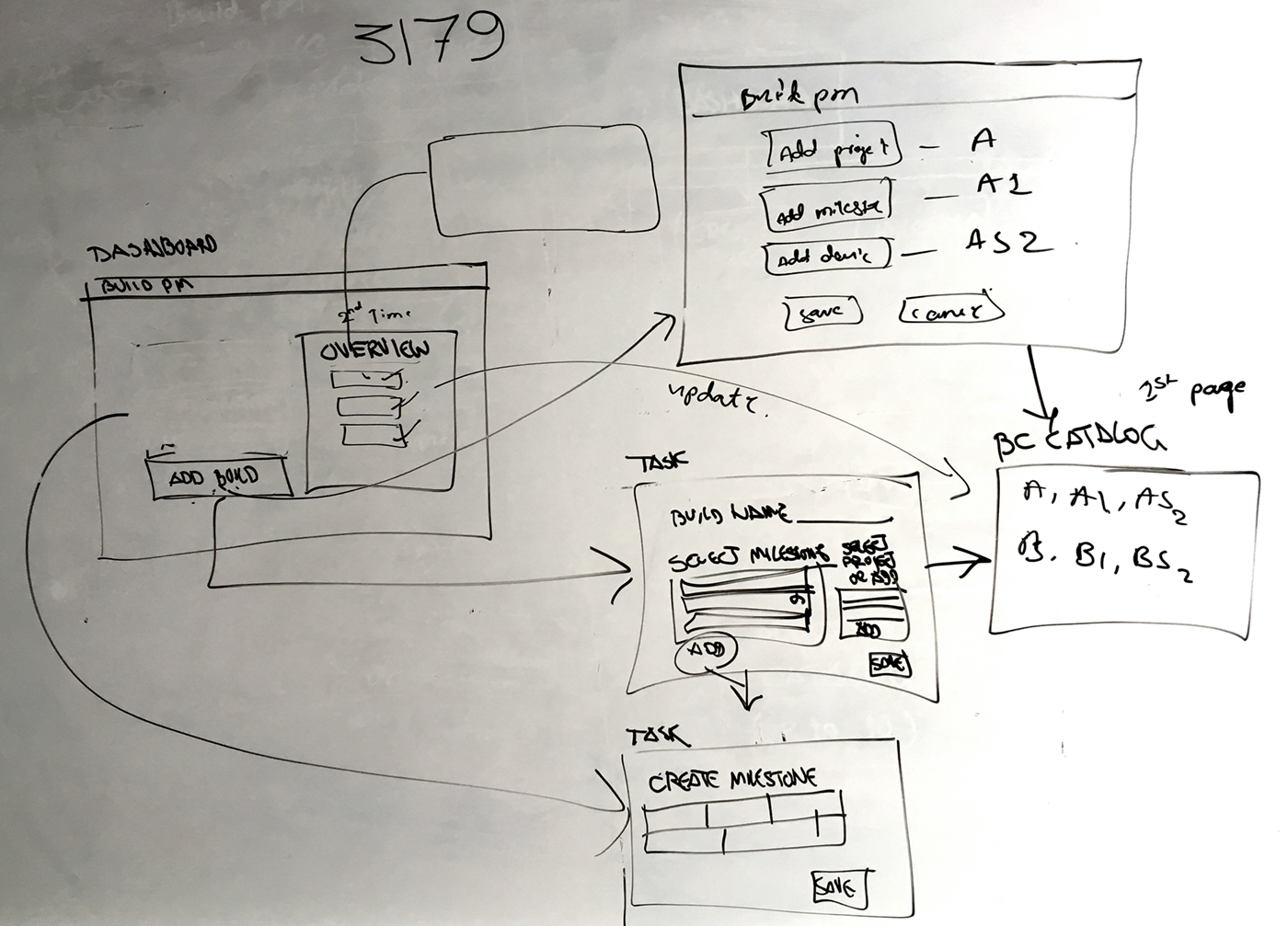
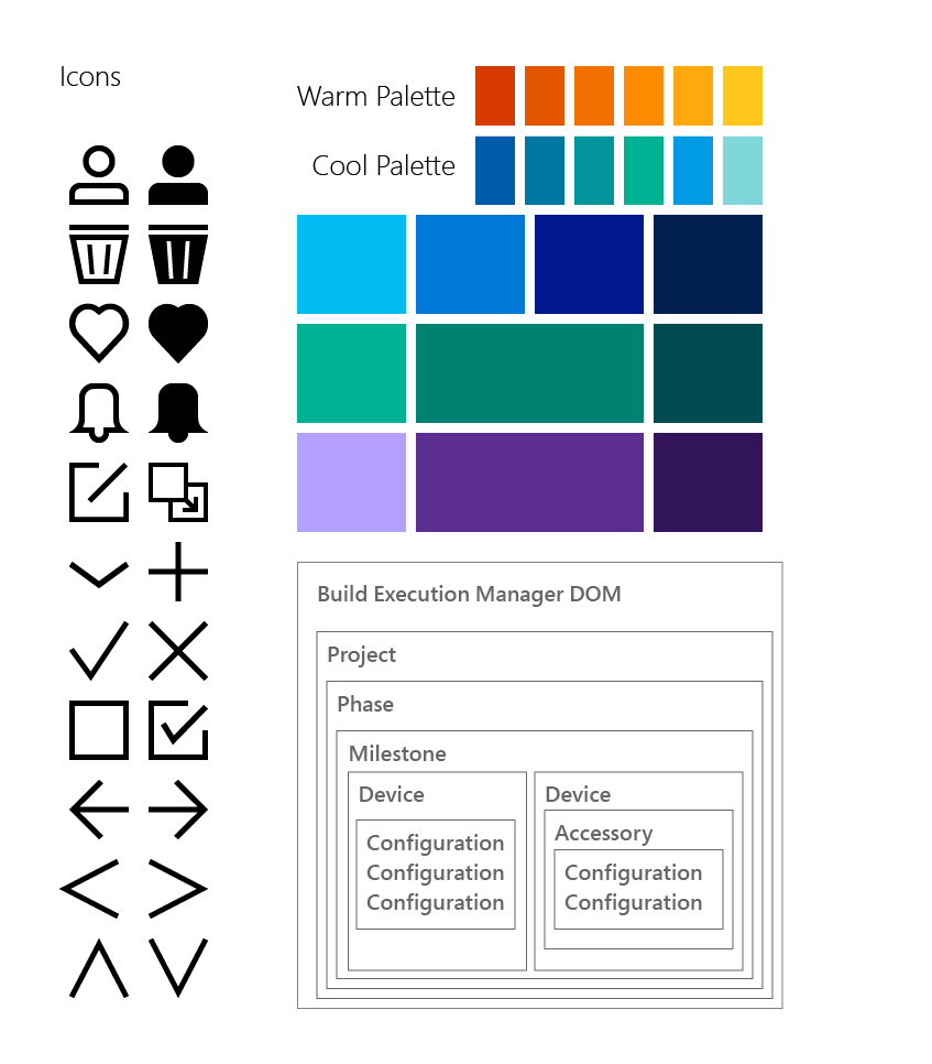
I contributed UX strategy, user workflows, information architecture, wireframes, colors, icons, typography, mockups and prototypes. The front-end and back-end developers used Angular.js for the framework, and I created my prototypes in native code as HTML/CSS. I provided documentation for the front-end developers to understand the CSS semantics.

Microsoft Build Execution Manager dashboard
The finished dashboard of the internal tool. The design utilized several parent-child display techniques to provide clear understanding of nested systems.
Early design exploration
Early design exploration focused on minimizing user inputs and tasks, and using visual perception to improve workflows.
The users of the internal web application were Build PMs, Lead PMs, Test Leads and DVEs. The success criteria for the tool was to provide clean visibility in device configuration from beginning to ship.
Icon and color development
I created an SVG icon font with state changes to improve usability with symbols where labels were superflous. Also, the color palette was based on Microsoft's color branding guidelines.
Additionally, a Document Object Model was diagramed to help the team visualized the hierarchy of information being managed by the tool.

Design Explorations

Many interviews with the stakeholders gave a clear insight into the value proposition of the tool. Our team used the information from these interviews to separate higher-priority tasks and information from those of lower-priority.

Whiteboard user workflows were explored to determine where critical decisions would need to be made, and how to streamline the user's tasks.

Stakeholder interviews also gave valuable insight into the target user's lexicon, so that controls could be labelled in a more semantic way.

Using an Agile SCRUM process, our team broke the features down into sprints, and further defined user scenarios from those features.

The user scenarios were defined as diagrams, with colors depicting screen templates and design patterns.

user workflows explored
The user workflow and UI structure was explored with the front-end and back-end team to ensure functionality proposed could be fully supported.
Build PM adds device by build name
Various scenarios were documented, and then diagramed with color-coded UX workflows. From these, UI components were designed for an efficient system.
Tester cycle
Scenarios were explored from begining to end to determine the most efficient course. These were measured against stakeholder value proposition.
early wireframe of system navigation
Early wireframes demonstrated solutions which worked better and others which did not. This wireframe shows an inventory with easy navigation at the top, but created a monotonous horizontal row grid.
adding resource wireframe
The problem of adding a resource when there were not resources in an inventory view was explored with modals and wizards.

Design Explorations, continued

Because it was a Microsoft project, our team was required to use Microsoft colors and typography. I thus created a style guide and mood board using these as starting points. The stakeholders initially considered three different color schemes, finally deciding on a cooler theme.

A monochromatic palette was used to improve contrast and maintain consistency. Saturated colors emphasized important areas, muted and lower-contrast areas receded naturally.

First mood board
A mood board was designed to demonstrate the application of harmonized colors in all instances of UI controls and content.
The Microsoft color branding guidelines were referenced as a starting point. The first direction explored was warm colors.
The warm palette applied
The UI with the warm paletted applied was nice, but the stakeholders felt it was too strong and perhaps created stress.
A purple theme was explored
A purple theme was explored, but also dismissed by the stakeholders.
A blue theme was explored
The team and stakeholders finally agreed on a blue theme with darker neutrals for a base.

Results

The project was shipped with a clean UI and a UX which helped keep important information in a central area, with visibility to all authenticated users for a specific device configuration milestone.

The PM, Avinash Kumar Rai, had this to say about my work: "The project had a tough timeline and a lot of complexities to start with. Jürgen not only helped streamline the requirement flow with his detailed workflows, but also started posing the right questions which helped us bridge gaps in the requirements. From detailed Workflows, Wire-frames, Mood Boards to SASS-based CSS and HTML. Jürgen was working like 'Flash'. He was quick, clear in thoughts and very vocal about his design principles."

The add resource screen
All resources were designed with an onboarding UI. It was designed as a wizard, with a required and option side.
the final product
The tool was designed to be responsive, so that with narrower screens the elements resolved smoothly.

/