Project Overview

The Problem

The team for a Hitachi Storage SE/Sales product were demonstrating data-reduction benefits, and needed a more efficient way to sell it.

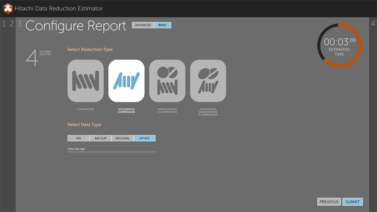
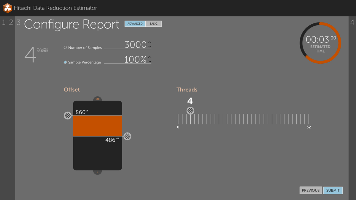
They were using a CLI to generate a report from which the data reduction could be demonstrated. This was time-consuming and required the sales person to memorize a long list of CLI codes.

Also, the CLI report of data reduction prioritized the experience to the machine instead of the user.

My Role

My task was to assess the user workflow in the CLI and convert it to a user-first GUI which would improve sales.

I had four days to create the UX/UI assets, as I was "loaned" to a product team onsite in Japan.

user workflow
The project was a simple tool to show progressive data reduction on storage systems. Vivid and harmonized colors over a darker and more neutral palette were used. This screen is of an alternate final report which is designed to be user-centered.
cli to bar graph image
The machine-centered report was generated in a simple CLI appliance. This is what needed to be improved by a GUI.

Design Explorations

Because of the short deadline, user research was completed with meetings before working onsite.

The user profiles were defined by the product manager.

When I began work, I started with user workflows, determining options and redundant steps.

HDRE flow-chart
The product was small enough to be reduced to six steps. Each step and alternates were given a serial number for referencing a corresponding wireframe and mockup.
Initial mapping of the user workflow
Initial meetings onsite determined high-level objectives and the most basic user workflow.
detailed screen and report concepts
The initial exploration of screens and tasks was simplified for human-centered design.

Design Development

The process started with wireframes. The exact number of steps in the tool were determined by how many tasks a user would focus on in each screen, and how to prioritize the inputs.

After wireframes were completed, a moodboard was created to set the general theme for the product.

To make production the most efficient, I relied on the existing design pattern system I had created for other Hitachi products.

images/hdre-moodboard.jpg
I designed a moodboard for the product to set a tone and style for all screens and assets. The strategy was to establish a contrast-based hierarchy. Lighter and more-saturated objects were of higher importance.
a wireframe of a resource inventory
Digital wireframes were completed to refined the design, with emphasis on the UI components.
inventory screen mockup
When the moodboard styles were applied, a unique solution to reducing controls was added. The icon for a resource would be an outline when unselected, and when selected, it would fill with a color. Additionally, the background color of a resource tile would become white, to increase contrast and display importance.

Mockups

a configuration screen
Users can select between basic and advanced configuration workflows. In place of a typical radio-button control, a larger version with icons was selected, to optimize available space and provide a simple, user-centered design.
the advanced configuration screen
The advanced configuration screen allows the user to hone in exact preferences. This called for innovative interactive inputs beyond the typical text entry.
compiling report mockup
When the report is being compiled, a status screen displays progress. A few data visualizations were created as efficient user-friendly indicators, including the ratio data visualization.
the final report
The final report displays progressive data reduction, with the most important final number being on the far right, with highest contrast.

Final Design

This project was a departure from my normal team function, as it was to be developed in a different coding environment, and the assests I provided were primarily PNGs.

The solution

While delivering a report in a CLI is easy and efficient, the experience is machine-prioritized.

The UX I designed for the tool operated on the Aesthetic Usability Effect, wherein a beautifully-designed product is perceived to be easier to use than a bland or utilitarian object.

The result was that sales persons were able to impress a customer with the ability to reduce data on a storage system by displaying a colorful and exciting report.

The report screen in the final product
The developer team created the final product with the mockups and UI assets I provided.
The report screen in the final product
Most of the final UI matched the mockups, with some exceptions.

/