The Market Need
Operators of data center infrastructures wanted a way to manage their systems in a converged package.
The various and complex components of the data center (compute, storage, network and virtualization) were being managed individually, which was a costly and time-consuming operation.
The product
Hitachi designed UCP as a web app which optimizes a converged infrastructure into one dashboard and management system.
My Role
I functioned as a UX/UI Designer. This included wireframing, workflows, sitemaps, mockups, documentation, asset management, and prototyping in HTML, CSS and JavaScript. I also load-balanced to help the developers and engineers in building product UI where they lacked skill or knowledge. In the testing phase, I fixed bugs connected to the UI code.
The UX Team
I backfilled for the initial UX/UI Designer when he left during end-game of v2. I carried the product as a team of one through v2 and v3 until two more UI experts joined and eventually took on the project.
These collaborators were Kyle Dybdal and Tiana Kavros. Usability testing was conducted by Garrett Rysko.

Design Explorations
Product marketing surveyed Hitachi's broad install base to identify the biggest administrative challenges. This, along with competitive research analysis, gave the engineering team a good picture of how to build the solution.
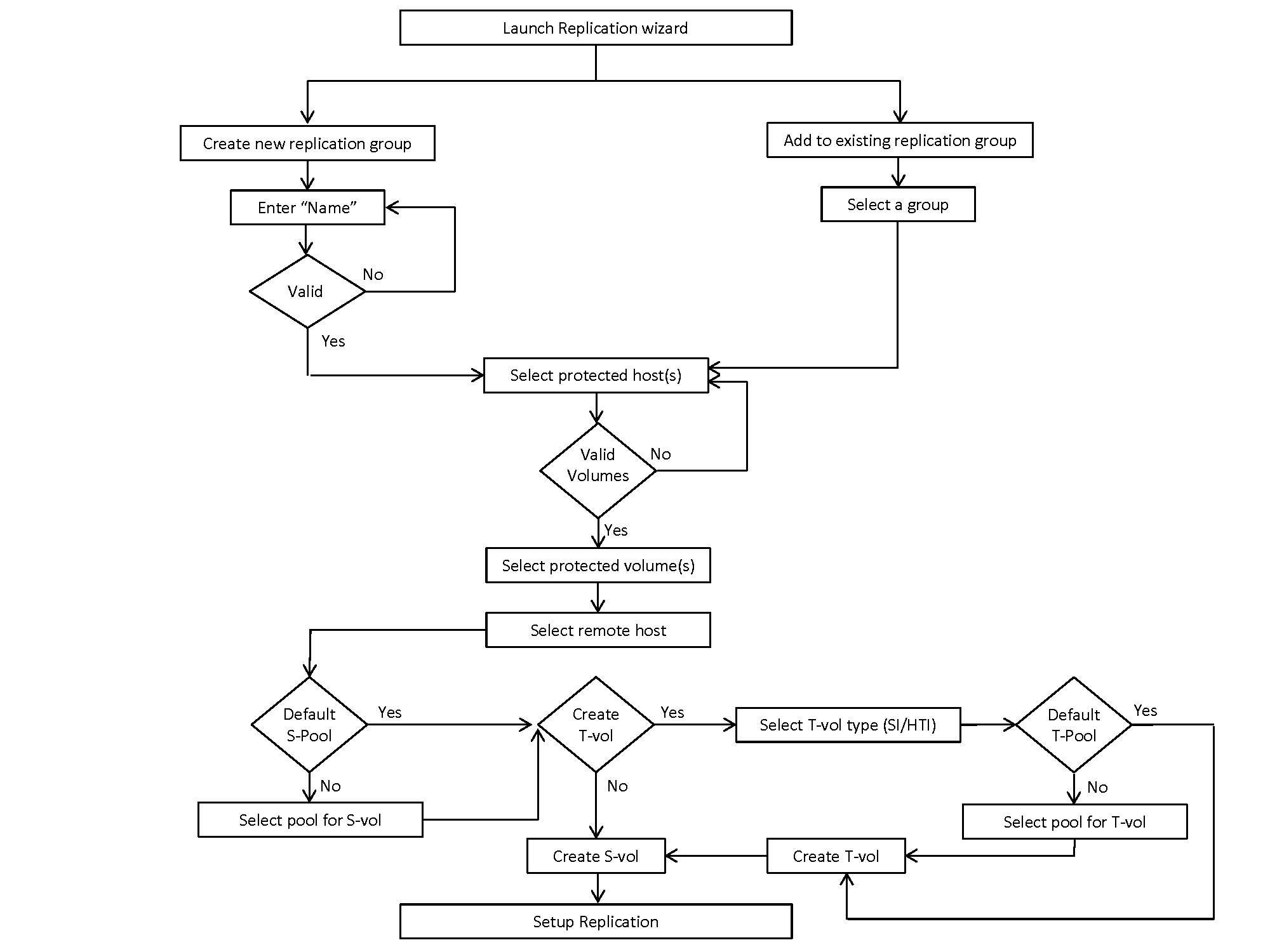
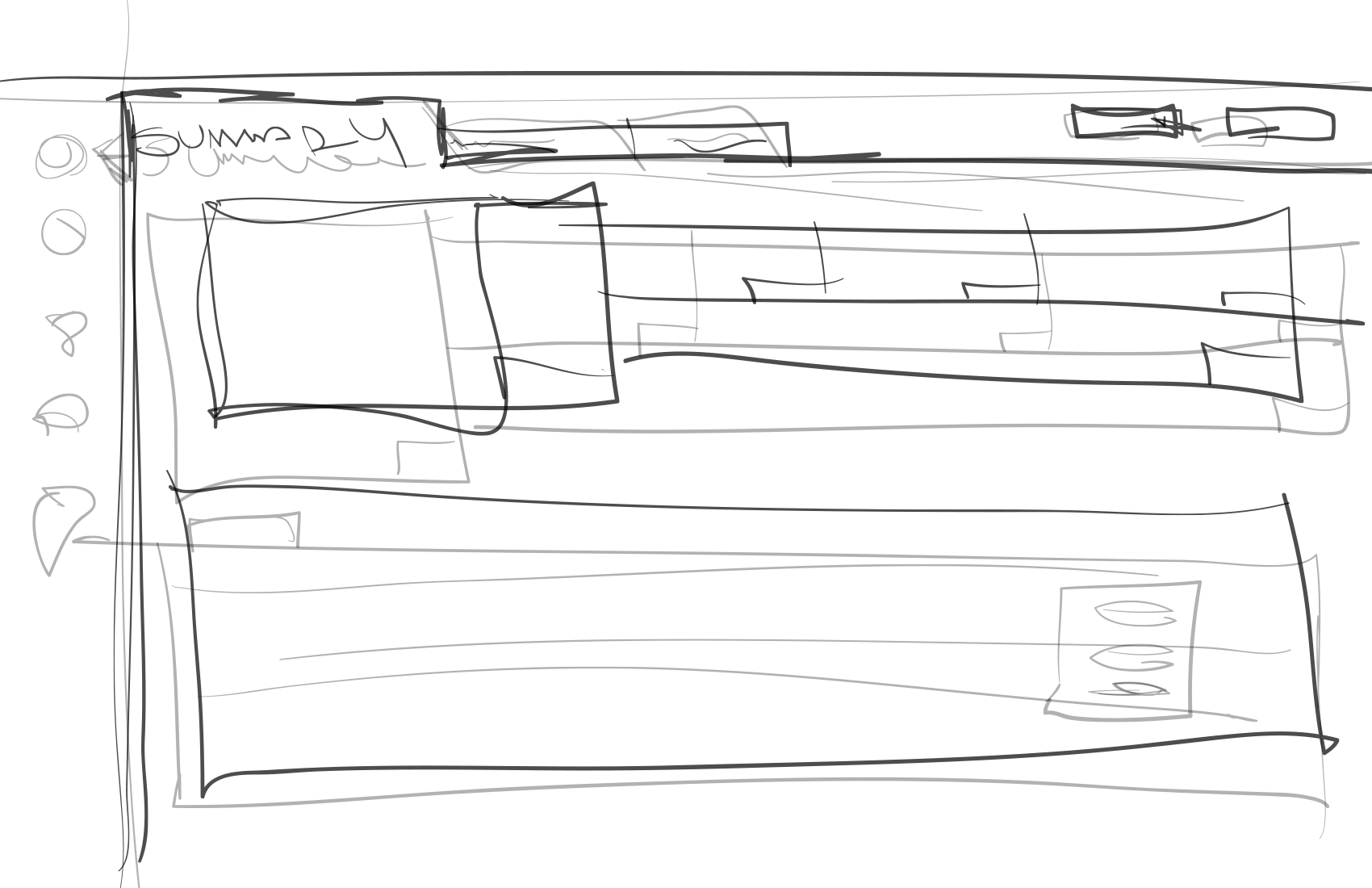
This data was used to develop user workflows and wireframes.
Early mockups and demos of the wireframes and storyboards were reviewed and iterated with cross-functional organizations within Hitachi, as well as with long-time Hitachi customers.
Design Development
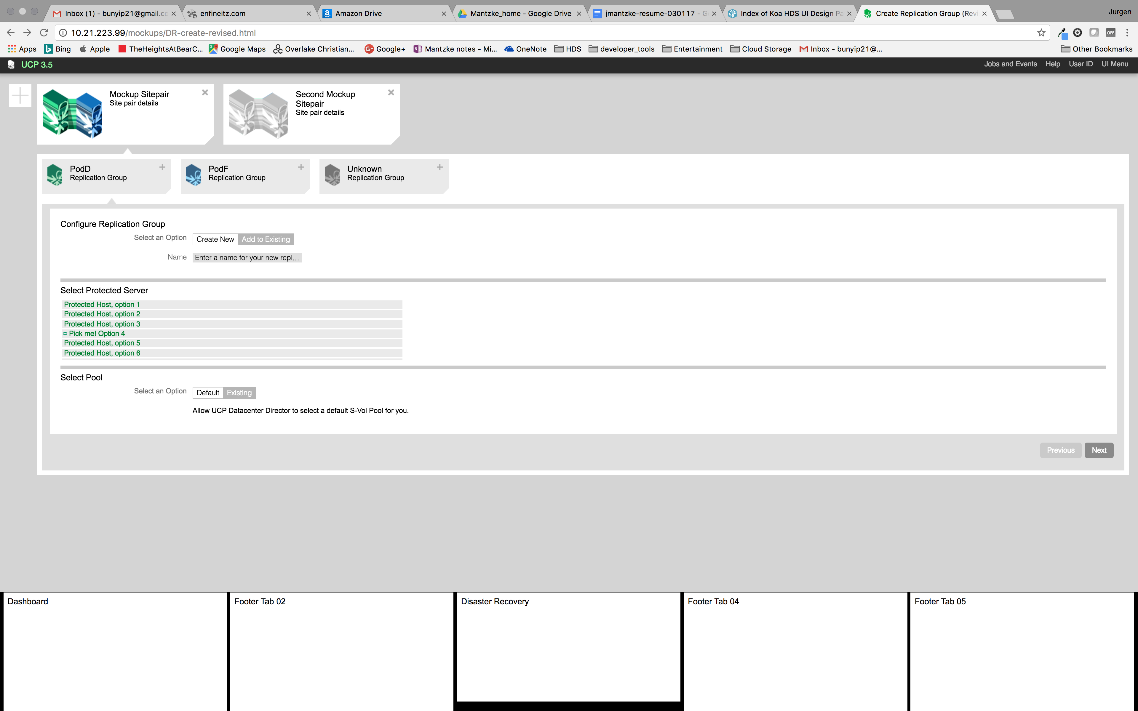
Much of the design milestones were completed in collaboration with product owners.
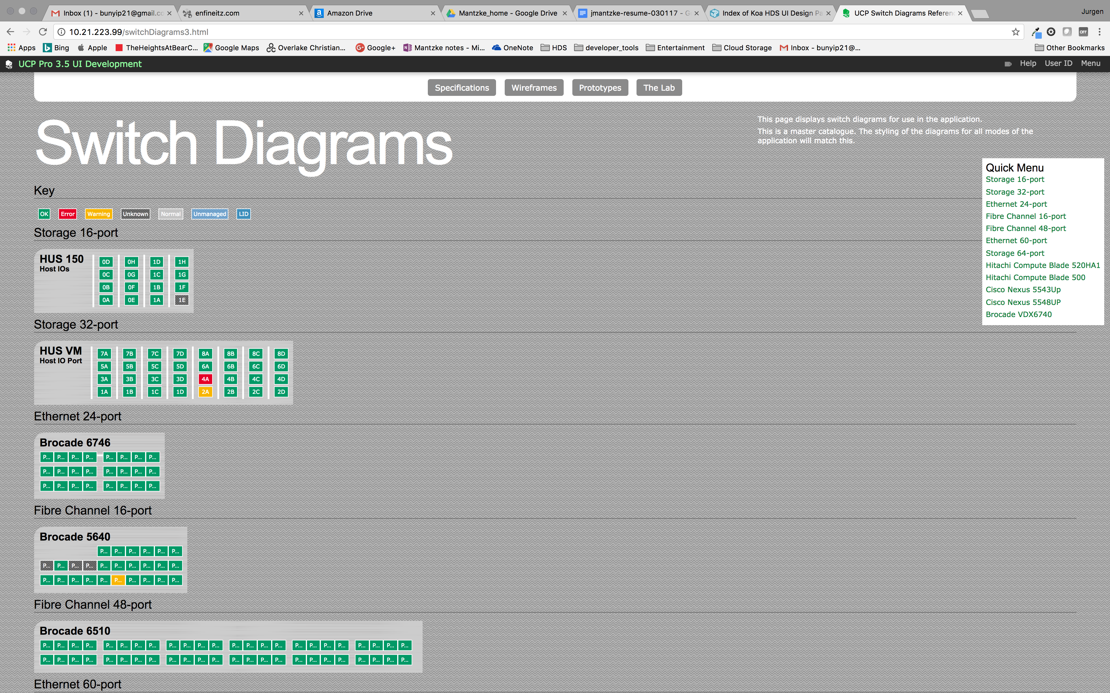
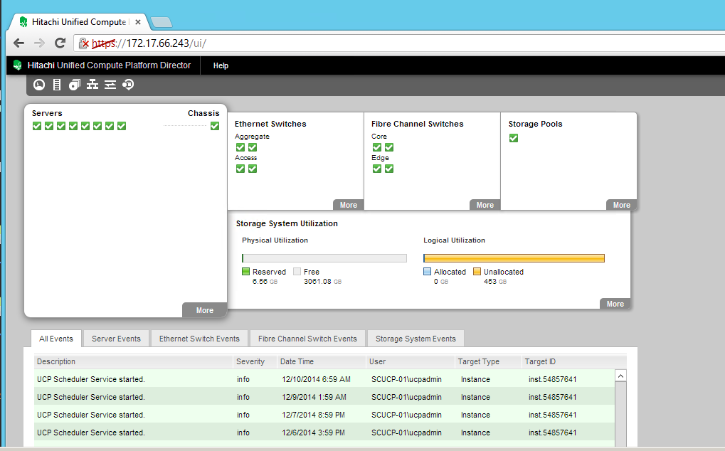
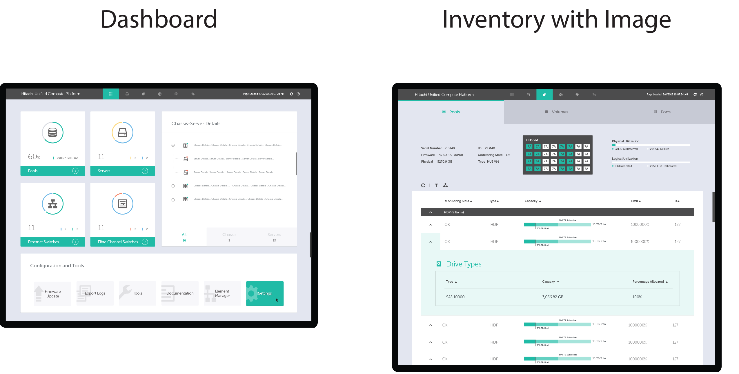
For v4, another designer joined and created mockups with a fresh look.
Final Design
The Solution
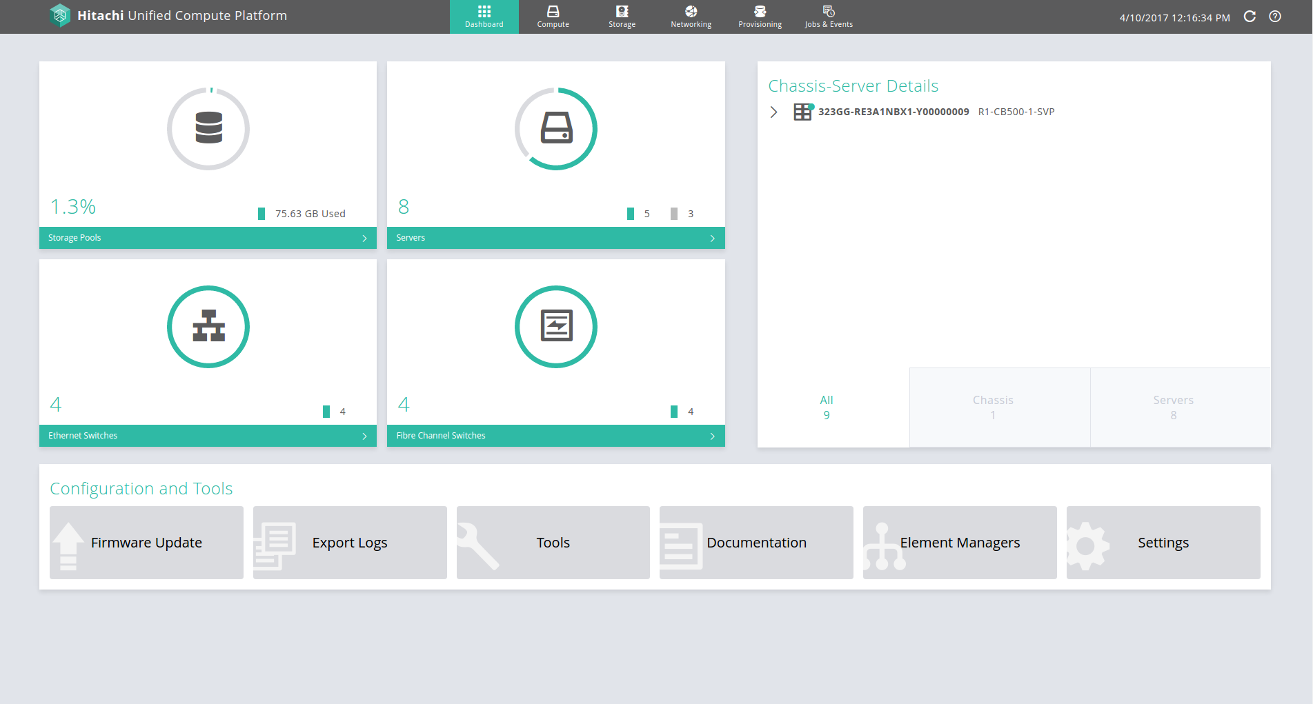
The UCP product aimed to reduce time to configure a converged infrastructure and deploy rapidly.
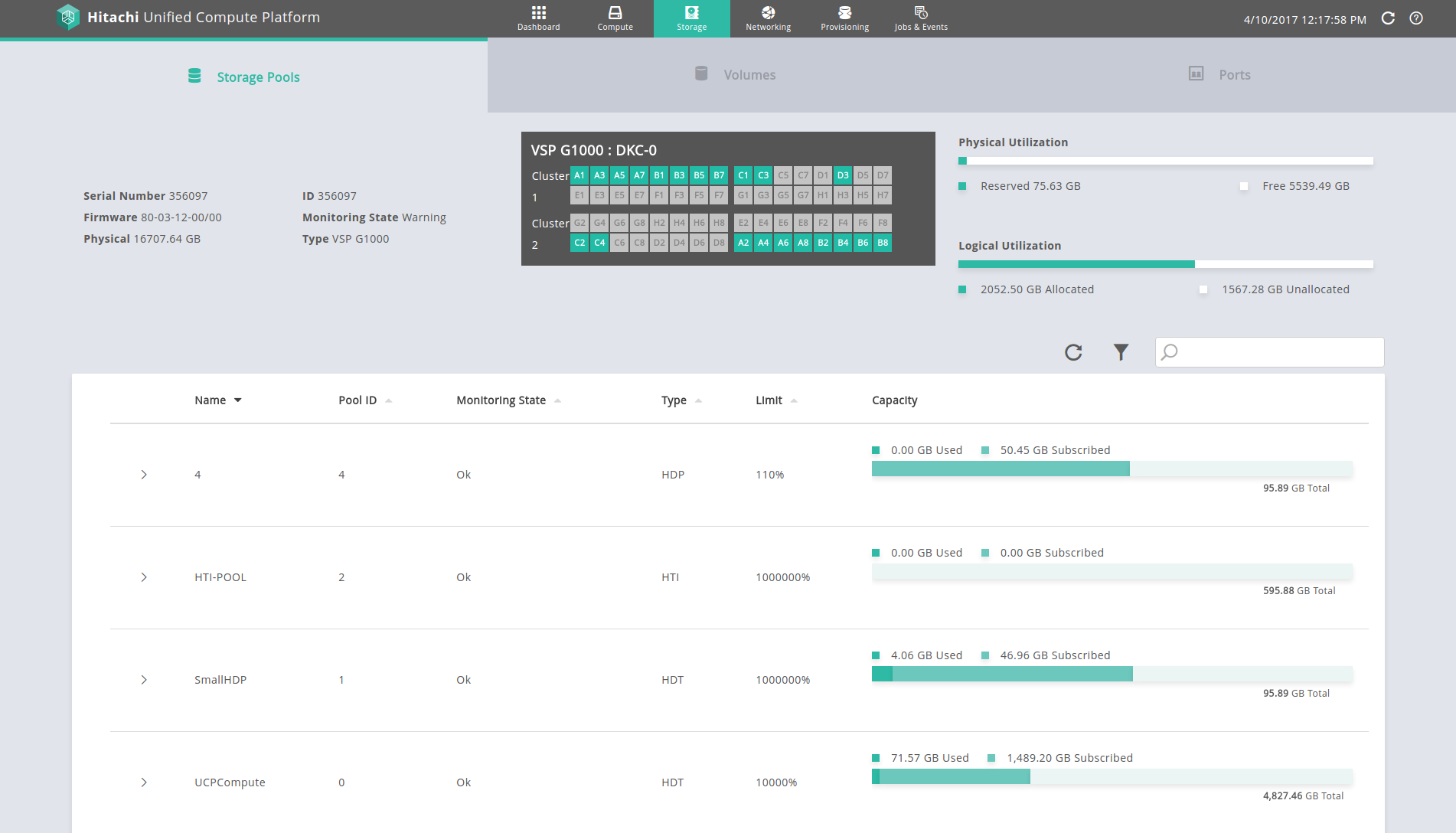
It was designed to deliver a comprehensive perspective of the infrastructure with relevant data points for inventory, health, utilization, topology and connectivity, and job status.
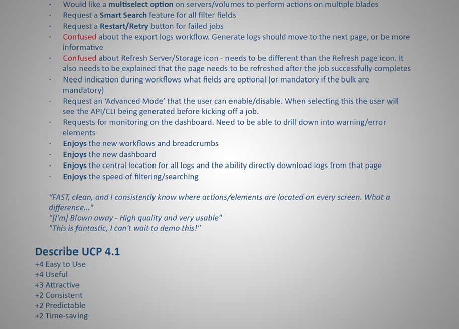
From usability testing and customer feedback, we found that the application has streamlined data center workflow, and provided an intuative learning curve.
Results
UCP Director has delivered approximately $350M in revenue to Hitachi over approximately four years since v2 was shipped.
It has over 100 unique customers, with many customers running multiple instances of UCP Director and UCP 4000.
Approximately 80% of UCP customers are Fortune 500 companies, and 20% are military and government.
/